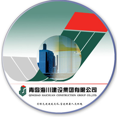


Enterprise VI-Logo Significance:
The predecessor of Qingdao Haichuan Construction Group Co., Ltd. is Qingdao Second Construction Engineering Company. Therefore, the logo adopts the combination of the initials "E, J"of pinyin "Er Jian". The main body uses capital "J" to simplify, which looks like a high-rise building. It also uses the the stripe decoration deformed form the character "E" in order to increase its upward straight graphic vision . The overall shape of the logo looks like a special building with annex and a raised spire, which embodies the industry characteristics of Haichuan enterprises. Besides, the three-dimensional space object also reflects the unique sense of volume, weight and space of the products produced by construction enterprises. After the above two deformations of the logo, the squeezing deformation from three-dimensional space to two-dimensional plane is carried out again. After squeezing, the shape of the logo is similar to the hook of the tower crane equipment. As a part of construction machinery, it can also reflect the characteristics of the construction industry. By choosing the combination of a large area of dark green and a small area of red, the logo is a metaphor for the unique beautiful environment in Qingdao, namely, red tiles and green trees. Using Haichuan’s standard color is to intensively embody the responsibilities and missions of Haichuan Construction Group to build the motherland and beautify the society. And it also shows the goal of Haichuan Construction Group to create the perfect living space.


